Old hands and policy wonks have mapped the shifts and drifts of Australian higher education policy over the last few decades.
Often these are viewed in a wider comparative context. The Education at a Glance reports, published each year by the OECD, can provide this.
Our most widely quoted international comparisons focus on funding. Up is good. Flat is sad. Down is dismal.
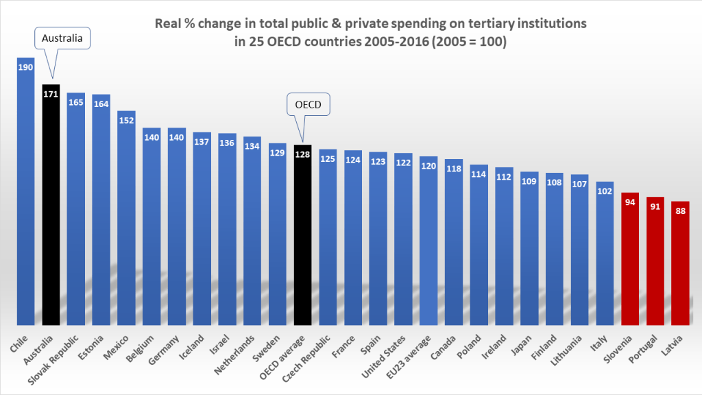
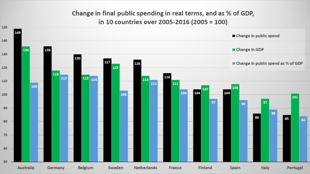
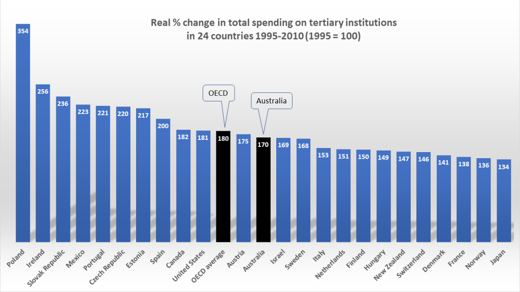
For many years, Australia has fared better than most. Since 2012, every report has shown our tertiary sector revenue growth outpacing the OECD average. In the 2019 report figures, total spending grew by 71% over 2005-2016. OECD average growth was 28%.
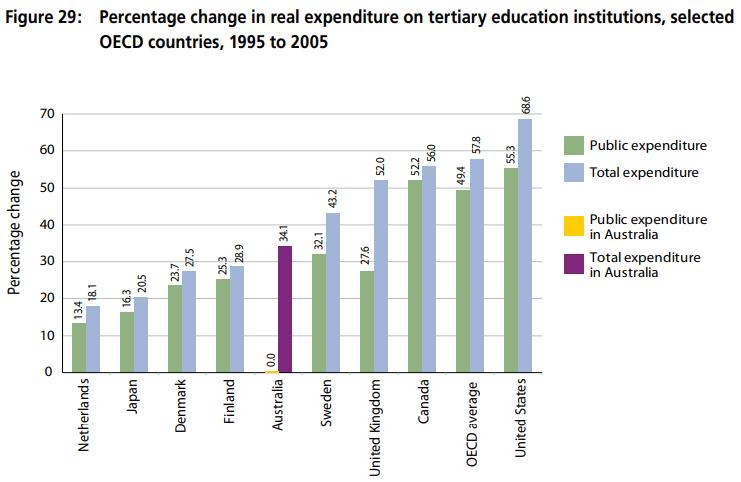
This trend reverses the low growth seen over 1995-2005. Back then, as highlighted in the 2008 Bradley Review:
Total national expenditure on tertiary institutions in Australia grew more slowly (34 per cent) than GDP (42 per cent) and significantly less than the OECD average (58 per cent)…
Review of Australian Higher Education
While total spending as a share of GDP was relatively high in 2005 (but lower than in cases such as Sweden and Korea, the Review noted), our decline in the public share of spending is seen as a problem. Simon Marginson has called this a “long free fall” from the end of the 1980s. In his report to the Bradley Review he noted that the OECD average level of public spending grew by 49% over 1995-2004, while in Australia it shrank by 4%. (To highlight this, the Review included just one graph to highlight real spending trends – in an “Anglo-Nordic plus Japan” sample of OECD countries over 1995-2005.)
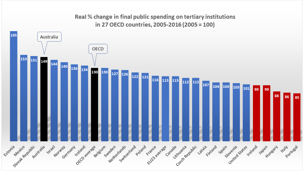
But again, this flat trend in public spending was reversed in the decade since, as “demand-driven” funding fuelled an enrolment boom. In “final” public spending (minus public loans to students) Australia saw real growth of 49% over 2005-2016. The OECD average growth was 30%.
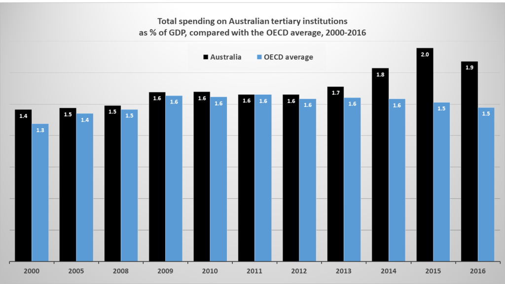
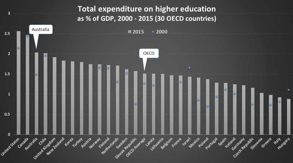
Compared to the OECD average, over 2000-2016 Australian tertiary institutions (university degrees and vocational diplomas) saw stronger growth in total spending (from all sources, public and private), as a share of GDP.
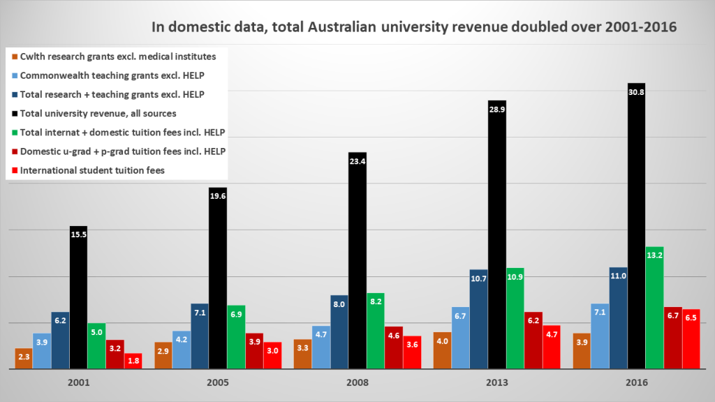
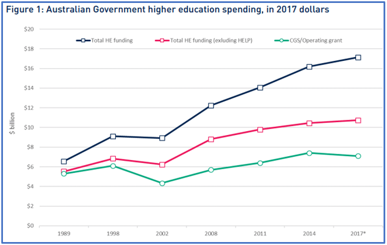
For the Australian university sector, domestic figures also show a strong growth trend. Over 2005-2016 teaching grants grew by 71%, from $AU4.2 to $7.1 billion. Research grants grew more modestly, by 33%. Combined, grants for teaching and research grew by 55%.
In student revenue, domestic fees (mostly HELP loan-financed) grew by 71%. The big lift was in international student fee income. These grew by 119% from $3.0 to $6.5 billion – double the rate for total revenue growth.
In 2017 a Grattan Institute expert observed that:
The last decade has been exceptionally good for universities, with the strongest increases in total public funding for decades and the strongest growth in private funding ever…
Andrew Norton
(The public/private split in Chart 4 is not simple. If, as expected, $1 billion in 2016 HELP loans is never repaid, net domestic fees in 2016 were less than $6 billion (19% of all revenue); and net Commonwealth funding was $12 billion (40% of all revenue). In turn, total domestic and international fee income was about $12 billion. All told, students and the Commonwealth each put in about 40% in 2016.)
Overall, domestic and OECD figures tell the same story: a decade of low growth, then a decade of high growth. The Australian mystery is this: over the last decade our local narrative about how we compare with others in the OECD hasn’t changed.
Later reports update the 1995-2005 trends in real spending seen in the Bradley Review graph. But the focus of local commentary has shifted, to spending as a share of GDP. On this basis, we’re told, Australian spending still lags most others OECD countries.
(Update, 2023) Australia is the fourth lowest country in the OECD for public funding, just above the UK, Colombia, and Japan (Senior Economist Eliza Littleton, Australia Institute)
2020 Our grants declined from 0.7 per cent of GDP in 1989 to 0.6 per cent of GDP in 2017 (Professor Katharine Gelber, ABC)
2020 Australia ranks in the bottom third of OECD countries – 24th of 37 (Professor Rodney Tiffen, Inside Story)
2019 We rank near the bottom of the OECD ladder for public investment (Catriona Jackson, Universities Australia)
2019 We have one of the lowest funded university sectors in the OECD (Professor Peter van Onselen)
2018 Public investment in higher education is second-lowest in the OECD (Jeannie Rea, National Tertiary Education Union)
2017 Other countries are turbo-charging their investment in higher education (Belinda Robinson, Universities Australia)
2017 Government funding for higher education is second-lowest in the OECD (Professor Peter Hoj, Group of Eight universities)
2017 Total spending has been flat since 2000 while rising elsewhere in the OECD (Universities Australia budget submission)
2017 In the bottom four – public investment is far more in Mexico, Estonia and Portugal (Julie Hare, KPMG)
2017 Public investment is 40% below the OECD average and in the bottom four (Geoff Maslen, University World News)
2017 The OECD ranks our public spending 30 out of 34 and in the bottom four (Universities Australia)
2016 Among the lowest in the OECD and getting lower with each passing year (Thornton McCamish, The Monthly)
2016 The OECD ranks our public investment 27 out of 32 (Belinda Robinson, Universities Australia)
2016 We finished 27 out of 32 … trailing the Slovak Republic, Mexico and Spain (Vicki Thomson, Group of Eight universities)
2016 Public investment fell from sixth-highest in 1995 to second-lowest (Universities Australia, Keep It Clever)
2015 Fees have risen massively while the proportion of university budgets coming directly from government collapsed from 90% to under 45% (Professor Raewyn Connell)
2015 Our universities are poorly funded by OECD standards – 33 of 34 for public funding (Dr. Emmaline Bexley)
2015 In 2011 public funding for our universities ranked 33 of 34 (Professor Rodney Tiffen, Inside Story)
2015 The OECD ranks us 30 of 31 for public investment (Professor Stephen Parker)
2015 Among the lowest in the OECD in public investment (Professor Linda Kristjanson)
2015 Since 1995 total spending has been relatively static while growing across the OECD (Universities Australia)
2015 We spend proportionally less public money on universities than most OECD countries…without fee deregulation we face chronic underfunding (Professor Glyn Davis)
2014 Our tertiary education spending is second-lowest in the OECD, after Japan (Dr. Gavin Moodie)
2014 Total spending on higher education has been static since 1995, while the OECD average has risen (Professor Peter McPhee)
2013 We spend 0.7% of GDP compared to an OECD average of 1.1%, a difference of $6 billion (Professor Simon Marginson)
2013 Public funding of higher education as a proportion of GDP has trended downwards to the point where it is now only two thirds of the OECD average (Professor Simon Marginson)
2013 The world is increasing participation and increasing spending. We are just increasing participation (Professor Simon Marginson)
2011 We spend less in public funding than almost every other OECD country (Professor Simon Marginson)
As this sample suggests, each year the sector’s story remains unchanged: by OECD standards our tertiary spending remains low, or flat, or falling. But in real terms, most others in the OECD have seen spending slow to a relative crawl. To those where growth has stalled – see Chart 11 – Australian sector revenue must seem as “turbo-charged” as a Mad Max movie.

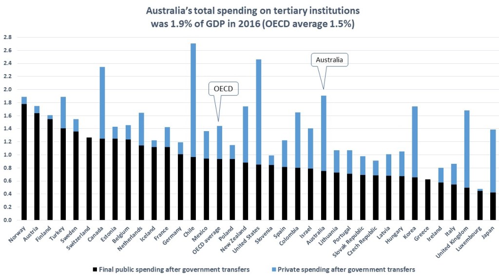
The OECD confirms that our public spending on tertiary education has risen for years, more so than in most other countries. And as domestic reports also confirm, total spending on our universities has not been “flat since 2000”. As seen in Chart 4, it doubled over 2001-2016.
So why the sharp disparity, when under-funding folklore meets revenue reality? In sum: simple-minded scans of poorly-probed OECD data. Here’s a typical example from 2017:
Australia rates among the bottom four countries at 0.7 percent of GDP in its public investment in tertiary education, or about 40 percent less than the OECD average of 1.1 percent. Public investment in tertiary education as a proportion of GDP is far more in … Portugal.
Julie Hare, KPMG
This view echoes other 2017 commentaries. But as Charts 1 and 2 show, by 2016 Portugal had seen years of spending decline: a 15% fall in final public spending, as Australia’s rose 49%. Clearly, shares of GDP don’t reliably compare levels of spending in cases like these. As Chart 5 shows, over 2001-2016 Australian GDP grew by 53%, while in Portugal it grew by 2%. The OECD average growth was 30%, and the EU average 21%.
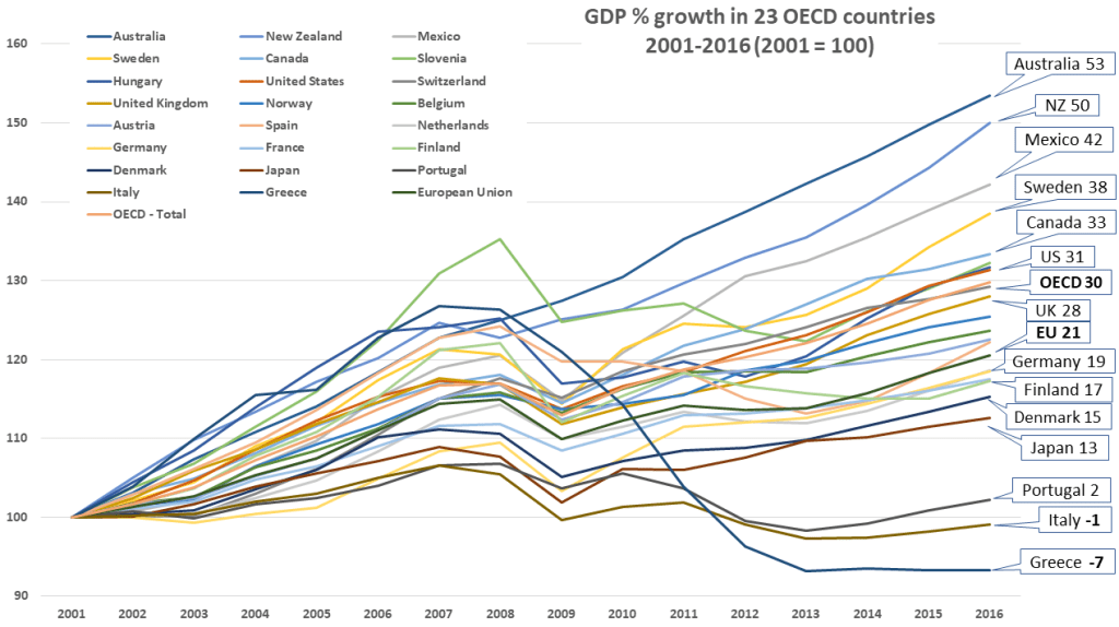
Since 2008 OECD reports have tracked how the financial crisis flattened economies – and in turn their tertiary spending. European countries were hit especially hard – none more so than Greece, where public funding to public universities fell by 65% in real terms over 2008-2016.
In Australia – a rare exception – none of these things happened. Yet few seem to grasp what this means for the annual “rankings” that animate Australian funding folklore.
Some examples may help. Charts 6-7 show how rates of spending differ from levels of spending, and how shifts in GDP can mask real spending changes in either direction.
In each case rates rose over 2008-09, as did the OECD average. Finland’s rate surged from 1.6 to 1.9% in 2009. Sweden’s surged also, from 1.5 to 1.8%. Germany’s rose from 1.1 to 1.3%.
But Australia’s rose only modestly, from 1.5 to 1.6%. France, Portugal, Spain and Italy saw modest rate rises also.
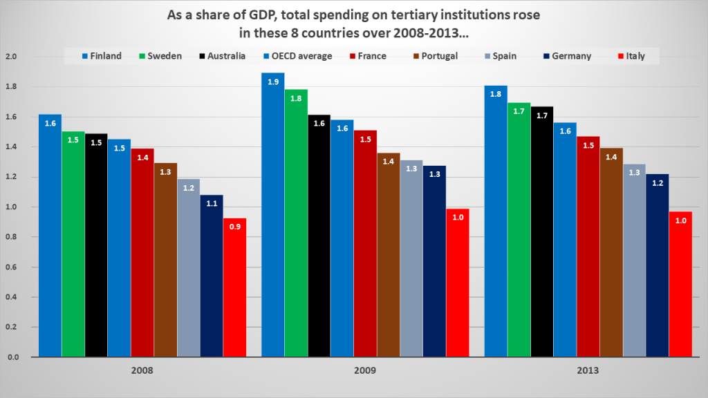
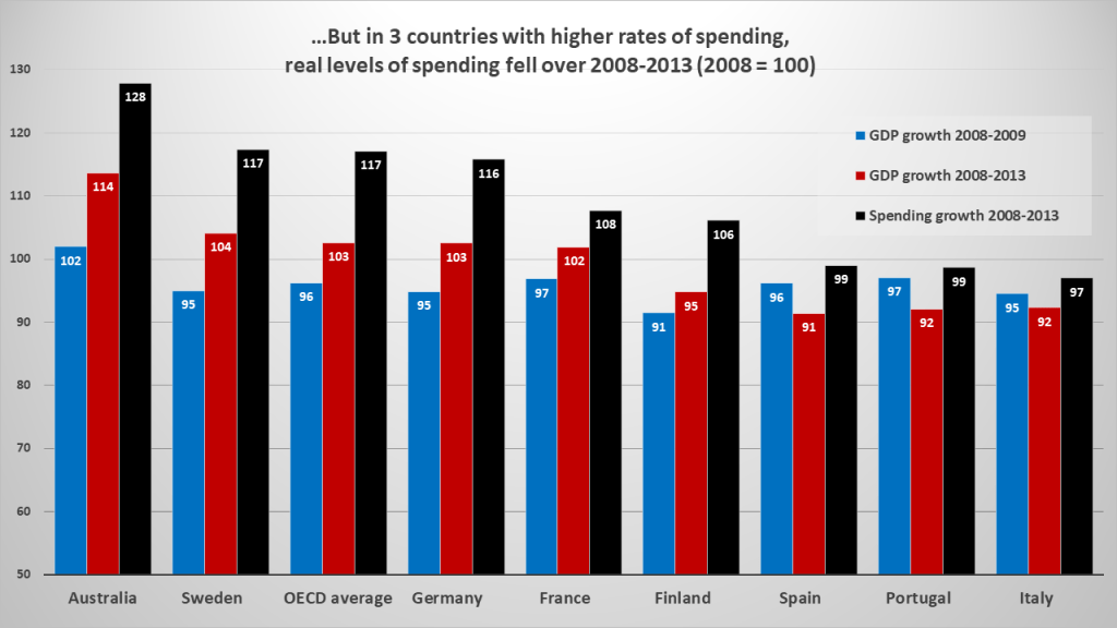
By 2013 all had higher rates than in 2008. Yet as Chart 7 shows, actual levels of spending in Portugal, Spain and Italy fell. In reality, Australian spending grew faster than the rest at 28%. Its modest rate rise in Chart 6 simply reflects faster GDP growth than the rest, at 14%.
Finland’s 2008-09 “rate surge” was not a spending surge. Rather, a 9% slide in GDP. Lower GDP in Sweden and Germany helped lift their rates also. And in Portugal, Spain and Italy, rates rose over 2008-2013 only because GDP fell faster than spending did.
Our most familiar “rankings” of Australian public spending are flawed for the same reason. Chart 8 shows how Germany, Belgium and the Netherlands had slower growth in their levels of “final” public spending than Australia’s over 2005-2016. But due to slower GDP growth, their rates of spending as a share of GDP rose further than in Australia.
Now, back to our “more public spending in Portugal” claim. All that the OECD numbers it refers to prove is that Australian apples aren’t Portuguese oranges. Nor, as Chart 8 suggests, are they Spanish or Italian oranges.
(Prediction: similar effects on rates of spending will appear in the 2023 edition of Education at a Glance. This week the OECD reported on the pandemic’s likely effects on GDP in 2020. Australia is likely to fare better than most others – a 5% decline while countries such as Italy, France, Spain and the UK decline by 11%. If no country changes its level of tertiary spending, rates as a share of GDP will rise less in Australia.)
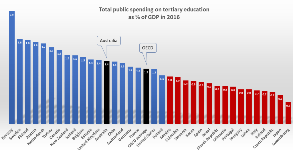
GDP disparities aside, there is a second context deficit. In their focus on metrics that define publicly-financed HELP loans as “private spending”, few seem aware of the OECD metrics which treat these as government spending. In “total public spending on tertiary education”, for example, Australia’s rate as a share of GDP was 1.4% in 2016. This is far higher than in Italy, Portugal or Spain (0.7-0.9%). As seen in Chart 9, more than 20 countries had lower rates.
The OECD’s 2018 report highlighted what this means for institutional revenue, by listing both “initial” and “final” government spending on tertiary institutions in a single table. Suddenly, rates of public spending on Australian and New Zealand institutions were above the OECD average – until the revenue was attributed to students as a debt owed to government.
For Australian universities, HELP loans to cover student fees make up about a third of total Commonwealth financing. The 2020 pandemic crisis highlights how critical this is to institutional budgets, as international student revenue falls. The government has guaranteed $18 billion in funding for the year, to cover research and teaching programs, and domestic fee income via HELP loans. If domestic enrolments fall, government grants and HELP loan funding will be paid to institutions as budgeted.
Today’s crisis exposes a blind spot in the way “under-funding” is framed. Many argue that the sector’s exposure to offshore students reflects a long decline in Commonwealth funding, from over 80% of revenue in the 1990s to about 30% in recent years. Such shifts, the story goes, reflect how funding cuts or shortfalls have reduced the public share of the sector’s revenue to well below the OECD average.
On this view universities “had no choice” but to take offshore market risks, due to “billions of dollars in funding cuts over the last decade”. However this ignores the scale of the offshore revenue boom. That this has “vastly outstripped” recent cuts to sector funding suggests heady ambition, not (just) miserly governments. For Group of Eight universities in particular, one expert concludes:
Growth on this scale was something universities chose to do, not a change forced on them by government policy … International student fees were the drug that fuelled a rankings addiction as well as the funding that filled resource gaps.
Andrew Norton
Seen in today’s context, the arithmetic seems clear: if the government-guaranteed $18 billion were only a 30% share, total 2020 revenue would have to be $60 billion. In 2018 it was $34 billion. Today’s crisis highlights what sector leaders know from experience, and what scholars should know from Grattan Institute reporting:
Despite the growth of private funding, universities remain reliant on government. In 2016, 58 percent of university cash flow – counting both grants and HELP revenue – came from government.
Grattan Institute, Mapping Australian Higher Education
In other words, the HELP loan spending shown on the right in Chart 4 could as readily be counted on the left, as “public financing”. (In their 2020 commentary on the financial implications of COVID 19, Frank Larkins and Ian Marshman confirm the point, putting total university sector non-government revenue at 46% in 2018.)
Since the Dawkins reforms, HELP loans have endured as a great Australian innovation (up there with the Ute and the Hills Hoist clothes-line). Most (not all) student debts are repaid years later, via taxation. As seen from abroad by Nobel-winner economist Joseph Stiglitz, our HELP scheme is “the envy of the world – it works”.
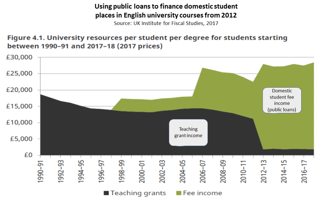
But, since access to study can be seen as “free” at the point of entry, universities have been tempted to argue for fee deregulation, despite the social equity risks and moral hazard this entails. And since loans cost less to finance than direct grants, governments too have been tempted to shift too much cost to graduates. This has happened already in the UK.
Australia has not gone as far as the UK. Yet many see our current settings as poor social policy. To make this case it has been convenient to set aside HELP money as simply “private spending” – despite its safeguards and substantial public cost. And with over 60% of revenue from private sources, the story goes, university funding is too low and our students pay too much. While some student debts can be large, few seem aware that Australian students meet around 20% of all sector revenue, including HELP loan repayments, as noted earlier with Chart 4.
Meanwhile in OECD metrics, public spending is reported in cash, not accrual terms. This skews the public/private spending split in Australia; and more so in the UK.
In local comparisons of OECD data, excluding HELP allows commentators to “rank” Australian public funding lower, by peering through the prism of a single slice of data. But as a view of tertiary sector resourcing, this paints a partial picture. All our “bottom of the OECD ladder” status compares is the bottom half of Chart 10: “final” public spending as a share of chalk-and-cheese GDP, minus the loan income paid to institutions by governments.
Australia’s “bottom-end” narrative should be seen for what it is: the curious, crowd-sourced love-child of an odd pair of Antipodean anomalies. Here’s how it works “at a glance”: first, ignore GDP disparities; then remove HELP from the equation. By focusing only on OECD figures that make neither factor visible, unreliable metrics look conclusive: a plausibly authoritative international “ranking“.
On this view, Australian public spending “looks like a duck” – forever adrift in the wake of its high-rolling OECD peers. But in practice our public spending “swims like a platypus”. It finances tertiary study at higher levels than most, in ways less visible than most.
Anomalies aside, Chart 10 illustrates two realities in international spending comparisons. From an institutional resourcing point of view, there is no OECD “standard” for the optimal share of public or private revenue. As long as courses of study remain accessible and affordable, overall revenue growth will matter more to a system’s success than whether its public/private split mirrors that of other systems. The Bradley Review implied as much, when it pointed to Korea as a better-financed system.
When advocates invoke “OECD standards” they refer to a mythical beast, best imagined as “more than we have here”. The adoption of any such “benchmark” was rejected in 2011 by Australia’s Higher Education Base Funding Review. It presented two OECD charts to compare total spending per student in 2008, and none on spending as a share of GDP. It noted that “some nations have experienced a falling GDP” and concluded that:
It is difficult to establish credible international benchmarks … because of differences between the funding systems and the diversity in many higher education systems…
Higher Education Base Funding Review, 2011
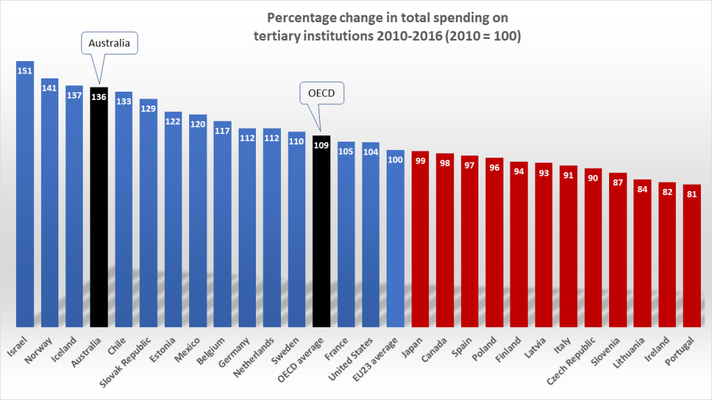
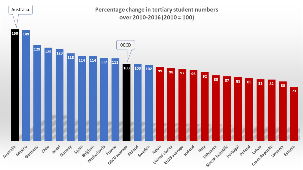
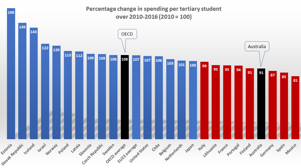
Elsewhere in the OECD, a more common starting point for comparisons is total spending per student. This raises an important caveat for the trend data seen in Chart 1. Australia’s revenue boom was built on booming enrolments, including in the vocational sector. So much so that, over 2010-2016, our total spending per tertiary student declined. As Charts 11-13 show, most other OECD countries had lower enrolment growth. Many saw enrolments decline as spending was capped or cut. This has allowed many systems to maintain or improve spending per student – but at the cost of lower levels of participation.
And now a second caveat on the first: despite the decline in Australian spending per student over 2010-2016, total resourcing per student for degree-level study still does not seem low, compared to most other countries. Chart 14 shows how Australia compared on total annual revenue per full time student for “long cycle” programs (including R&D spending) in 2016. Here Australia spent nearly $US21k per student. The OECD average was nearly $17k. Portugal and Italy spent $11-12k.
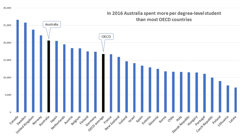
To Universities New Zealand, this dataset shows that the Australian university sector is better-funded than most (including New Zealand) for degree-level students. For OECD director Andreas Schleicher, it shows that even the stronger European systems have struggled due to revenue per student falling. In 2016 he cited Germany as a case in point:
The German funding model is simply not sustainable … the government isn’t able to provide the funding nor does it allow public universities to mobilise private financing. That’s why you see a decline in spending per student…
Andreas Schleicher, OECD
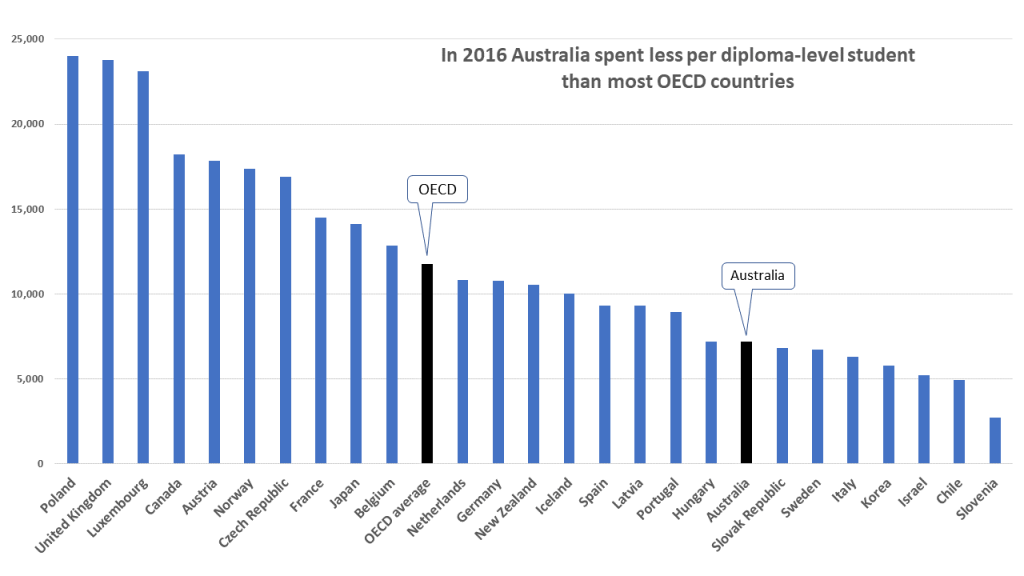
That said, a third caveat on the second is that in 2016, the Australian system looked much weaker in spending per student at the sub-degree level, where vocational diplomas loom large. Here most other countries (including Germany, New Zealand and Portugal) look stronger. This is consistent with concerns in recent years that the Australian VET sector needs system redesign and funding model repair.
Overall, most OECD evidence doesn’t fit the Australian folklore. In that narrative all we ever seem to see is a sector “ranked near the bottom for public investment”. Some say even total spending in Australia peaked circa 1995, then remained static despite rising participation. In 2013 one Melbourne Centre for the Study of Higher Education expert put it this way:
“in 2010 Australia spent 1.6 per cent of its GDP on tertiary education…In 1995, Australia likewise spent 1.6 per cent…The OECD average was then 1.2 per cent. It has now risen to 1.7 per cent. The world is increasing participation and increasing spending. We are just increasing participation…”
Simon Marginson, MCSHE
However, this contrast of rising enrolments and a flat rate of spending is an unedifying juxtaposition, at odds with the spending-per-student trend data seen earlier in the same OECD report. In those metrics the OECD uses GDP-adjusted figures for good reason. Its 2013 report showed that while Australian tertiary student numbers rose by 73% over 1995-2010, real tertiary spending grew also, by 70%. And while the OECD average rate (as a share of GDP) surged, its real level of spending grew by 80% – only moderately faster than ours.
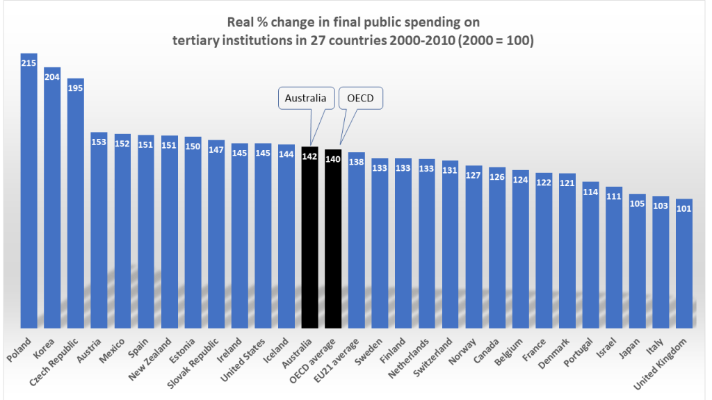
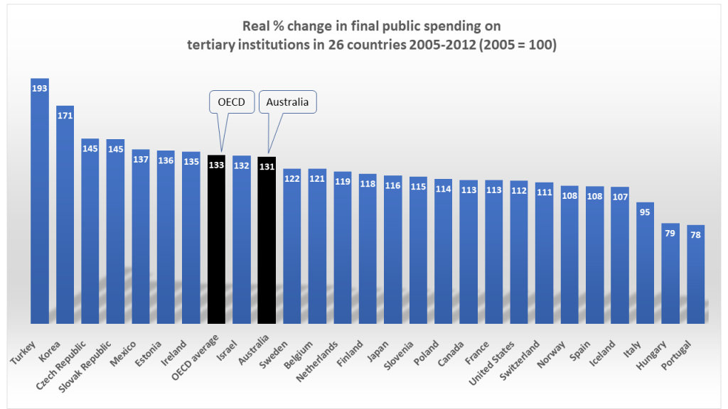
With final public spending growth, the 2013 report told a similar story. The simplest OECD figure to take here was for 2000-2010 (Chart 17). Australian public spending rose by 42%, about average for OECD countries. Chart 18 tells a similar story with data from the 2015 report, for the period 2005-2012. Over 1995-2010, OECD average public spending growth had run well ahead of Australia’s in the 2013 report, as HELP loans took up a larger share of our public financing. But when comparing the latest trends, how far back should commentators set baselines? If the starting points are well before the previous decade, how relevant are these to domestic funding debates?
Back to the mystery: how has the Australian folklore survived for so long? A likely factor is that for the sector’s funding advocates, it has been too easy. Life is short, and OECD reports are long. Their plethora of metrics is a cherry-picker’s picnic – ripe for weaponisation in funding disputes.
Any steady diet of familiar factoids can create confirmation bias, and uncritical acceptance of apparently authoritative commentary. In this case, a little bit of group-think goes a long way. If a peak body says we’re “30 out of 34 and in the bottom four”, media reports will concur that the OECD ranks us in “the bottom four” – no matter what arithmetic might say. In 2017 even the National Press Club – where journalists often challenge guest speakers – accepted at face value that our funding was “second-lowest in the OECD”.
A second likely factor is the sector’s well-founded anxiety about the ever-present prospect of funding cuts. As journalist Julie Hare noted in 2018
Each May as the government of the day takes efficiency dividends … the sector screams blue murder and points to the OECD data…
Julie Hare, Wonkhe
And so it goes. Any scan of the usual dataset will darken the sector’s mood – like a winter evening watching Scandi Noir. Why, our public funding isn’t within spitting distance of those Nordics! And Finland spends more than double our rate!
But only “at a glance”. By morning the surge of public policy Stockholm syndrome tends to fade. Wonky exhortations to “make Australia average again” look like a bridge too far. As one eloquent proponent concluded in 2015, perhaps the sector’s funding slogan could be: “Let’s catch New Zealand”.
Afterword…
My view on this topic since 2012 has been: “the more deeply we probe to tell apples from oranges, the more fruit salad we find”. Since 2015 I’ve pointed to flaws in the Australian narrative in The Conversation, with updates there and elsewhere in 2016, 2017, 2018 and 2019.
It’s a topic where academic politics and sector interests loom large – and where heretics risk being gagged. A paper published in 2016 was decried in The Australian newspaper during the sector’s annual conference as “an extraordinary attack” on sector leaders, experts and colleagues at the University of Melbourne.
As related in Diary of an Academic Infidel, in response I circulated the paper, inviting debate of its analysis. No-one wanted to unpick the substance, or publish a counter-critique. Despite my explanations, a complaint led the Journal to cancel publication, citing “inappropriate” content.
In 2017 I republished Beautiful Lies, Damned Statistics in an overseas journal. I sent briefings to sector leaders on the issues it raised. Few responded directly. But as time passed, the informal feedback from Canberra was clear: my view was misguided; airing it might cause problems; it would be best for all concerned to drop this line of argument.
Despite the allergic reactions, in early 2018 I put my case at a public seminar at the Melbourne Centre for Vocational and Educational Policy. None who attended disputed the analysis. In 2018 and 2019 I published updates of the same critique, in the Australian Financial Review and The Conversation.
But still the narrative endures. In a 2019 Conversation piece I reprised my view in 1000 words and 6 charts, with an offer to send a 3000 word paper with 20 charts to anyone interested. No-one was.
But the piece provoked a brief written response from the sector’s peak body. Universities Australia CEO Catriona Jackson denied any problem at all with the sector’s “standard practice”:
“Public funding for universities (as a share of GDP) in Australia is low by international standards and flat over time. That’s what Universities Australia and others in the higher education sector have been saying – because it’s true. On the latest OECD figures (2016), public investment in tertiary education institutions in Australia was 0.75 per cent of GDP – the same figure as in 2000. Over that time, the number of domestic students grew by more than 75 per cent. The UA Budget submission cited in [your] article used 2013 OECD data … This showed only one country in the OECD (Japan) invested less public money … Comparing spending in different countries as a share of GDP is a standard practice…”
By now the enlightened reader can decode this script: it juxtaposes surging enrolments of 75% (or 70% in Grattan data) with a “flat” rate of public spending (0.75%). What UA didn’t say was this: over 2000-2016 Australian GDP grew by nearly 60%; grants to universities for teaching and research grew by 80%; “total public funding” for tertiary education rose to 1.4% of GDP; in OECD data Australia’s “final public funding” rate looked “second-lowest” in 2013 due to data gaps and UK misreporting of student loans (see graph and details below); the 2017 UA submission claim of “flat” total spending since 2000 was a blunder (see chart below); neither the 2008 Bradley Review nor the 2011 Base Funding Review relied on spending as a share of GDP as a significant point of comparison; real growth trends in final public spending on Australian tertiary institutions have been similar to the OECD average in most recent OECD reports (see Charts 17 and 18); and in practice, the use of final public spending as a share of GDP as the primary basis for OECD comparisons has misinformed public debate in Australia for most of the past decade.
Implicitly at least, the fact that Australian universities have seen good growth in total public spending (outlays) is writ large in Universities Australia’s July 2019 Facts and Figures report (chart below).
This “Big Little Thought Crimes” post presents quite a few charts, so that higher education students, scholars and policy-makers can test the various claims against evidence, and form their own views of the Australian mystery.
For their part, old hands and policy wonks may see no mystery at all. As the late Cliff Adelman wrote in “The propaganda of international comparisons”: “Ironically, trying to teach basic math … to the U.S. college-educated adults who wrote these reports is like talking to stones. They don’t want to hear it.”
Notes
More charts could be added to this post. For example, some suggest that the OECD’s “purchasing power parity” (PPP) estimates of spending per student are less relevant than spending per student as a share of GDP per capita. In that metric the Australian figure was above the OECD average in 2016 for degree-level students, and the rates for Germany, Portugal and Italy. But not as high overall as in PPPs. In New Zealand, for example, the GDP per capita rate was above Australia’s. (Update: a later post has a chart on this, for 2017).
From domestic data some Australian figures in OECD reporting are boosted by a HELP loan spending blow-out in our vocational sector. This peaked in 2015. As a share of GDP, our total tertiary spending peaked at 2.0% of GDP that year (see the chart above), then slipped back to 1.9% in 2016. Since VET loan spending declined further in 2017 it seems likely that when the OECD’s 2020 report appears, our rate will slip lower, but remain well above average.
Since posting, I’ve added some graphs and updated the text, adding further links to relevant commentary.
September 2020 update
The OECD’s 2020 report appeared on 8 September. It disproved my prediction that our total rate would slip below 1.9% of GDP. Instead it rose to 2.0% of GDP in 2017, as the OECD average slipped to 1.4. I’ve provided some new charts with data from the 2020 report in my September post, Let’s Glance…
